What buyers check first on your website, and how to pass
Before anyone reads your carefully written About page, they run a quick, mostly unconscious set of checks. Here is what they look for.
By the Mahnovas Digital studio. Published
When someone lands on your website from a search, an ad or a recommendation, they do not read it from top to bottom. They scan for answers to a few practical questions, and they decide quickly whether it is worth staying. The questions are surprisingly consistent across industries.
1. Is this what I am looking for?
The first screen has one job: tell the visitor what you do, for whom, and what makes it worth their attention. Clever slogans that need a second read fail this test. So do hero sections that rotate between five messages.
A useful exercise is to cover everything below the first screen and show it to someone outside your company. If they cannot say what you sell within a few seconds, the headline needs work.
2. Is this business real and active?
Visitors look for small signs of life: a recent article, a current year in the footer, contact details that are easy to find, a company name that matches the domain. Broken links, old news and a contact page with only a form all raise quiet doubts.
- Show a real email address, not only a form.
- If you offer phone or WhatsApp support, make it visible.
- Include your legal company name and registration details where your market expects them, often in the footer.
- Keep at least one part of the site visibly up to date.
3. Have they done this before for someone like me?
Proof is most convincing when it is specific. "Trusted by leading brands" says nothing. A named case study with a clear problem and outcome says a lot, as do real testimonials with a person's role and company, used with their permission.
If you are a newer business without much client work to show, do not invent it. Show your process, your thinking and the quality of your own site instead. Visitors are better at spotting fabricated proof than most companies assume, and one fake review undermines every real one.
4. Roughly what will this cost me, and what happens next?
Many service businesses hide every hint of price, worried that a number will scare people off. The result is often the opposite: buyers who cannot tell whether you are in their range simply move on. You do not need a full price list. Typical project ranges, a starting price or a clear description of how you quote can be enough.
Equally important is what happens after the visitor gets in touch. "We will reply within one business day with questions or a time to talk" is reassuring. A form that disappears into silence is not.
5. Does it work on the phone in my hand?
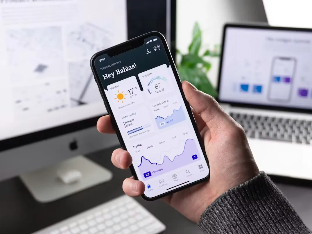
Many first visits happen on a phone, often in a spare moment. Text that is too small, buttons that are too close together, pop-ups that are hard to close and pages that load slowly all end the visit early. Test your key pages on an average phone over mobile data, not only on a desktop with fast Wi-Fi.
A quick checklist
- The first screen says what you do and for whom, in plain words.
- There is one obvious next step, repeated where it makes sense.
- Contact details are visible, and the form asks only what you need.
- Proof is specific, real and permitted.
- Visitors can tell roughly what working with you costs or how pricing works.
- Key pages load quickly and work well on a phone.
- The site shows clear signs that it is maintained.
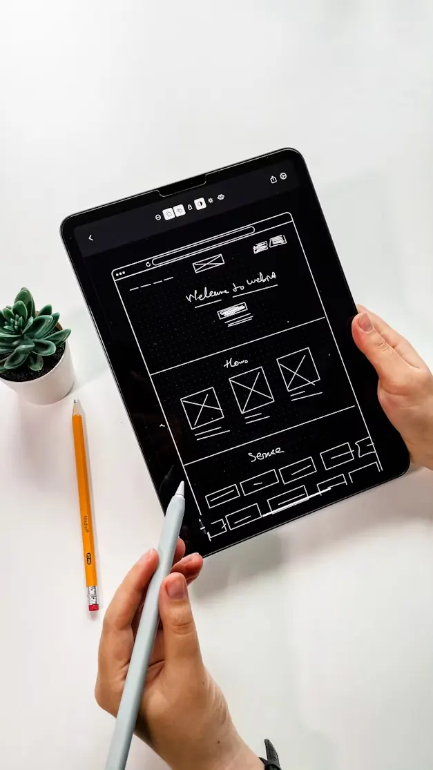
None of this requires a redesign to start. Most of it is content and structure, which is why we plan both before any visual design when we work on UI/UX design projects.