Account opening in three screens instead of nine
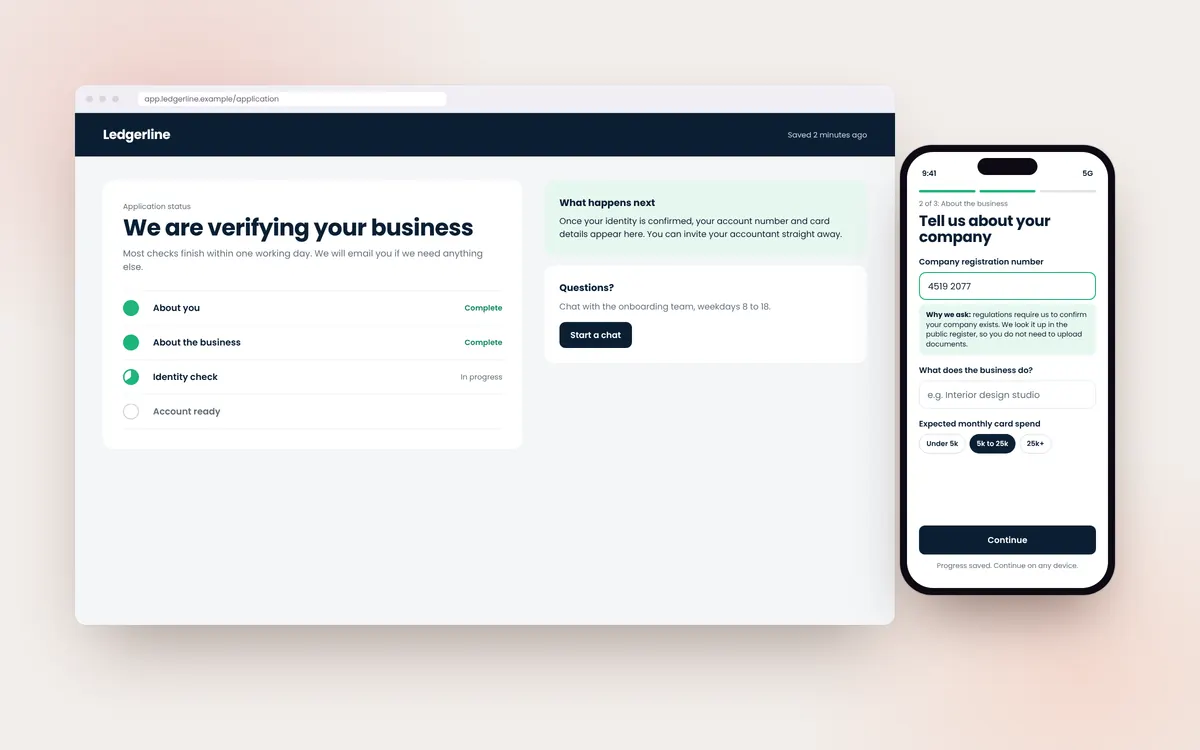
Financial onboarding has to collect sensitive information and meet regulatory checks, which makes it long. Length is not the only problem, though: people abandon when they do not understand why something is asked or cannot finish in one sitting. This concept redesigns account opening for a fictional business account provider, Ledgerline.
Self-initiated design study. Not a client project.
The problem
In this scenario the current flow spreads questions across nine screens, asks for documents before explaining why, and loses all progress if the user leaves. Support receives many messages asking whether an application went through.
Design decisions
-
Group questions by what the user already knows
About you, about the business, and verification. Each screen asks only for information the person can answer without looking anything up.
-
Explain every sensitive request
A short line under each field explains why it is needed and how it is protected.
-
Save and resume by default
Progress is saved after each answer, and a secure link lets the user continue on another device.
-
A status page instead of silence
After submission, users see where their application is and what happens next, which removes the need to ask support.
What we would measure
- Application completion rate
- Drop-off by screen
- Time to complete
- Support messages about application status
Services involved
Let us build the website that keeps working after you log off.
One conversation, no obligation. You will come away knowing where your current site is losing business, whether you work with us or not.
Email us: mahnovasdigital@gmail.com